London house price heat map
We created a heat map of property prices in London. Are you hot or cold?
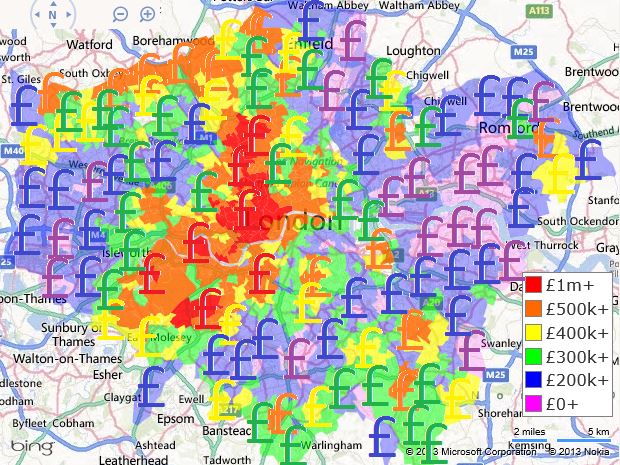
After much research into property transactions recently we have taken the average property sale prices over the past year of available data (July 2012 to July 2013) and added them to a "heat map" of London.
This displays areas of London as either hot or cold determined by the average price of property sales over the past year. The more expensive the recent property sales, the closer to red (hotter) it will be; the less expensive the property sales are, the closer to violet the area will appear (colder).
You can see from the key that that colours starts from violet and rising though blue, green and yellow to orange at £500k+ in steps of £100k. We then jump to the most expensive neighbourhoods in London representing by red for property sale prices averaging £1 million and over.
So let's take a look at how a property price heat map of London would look:
We can see the £1 million boundary is consistantly surpassed through much of the West End in areas of Camden, Westminster and Kensington and Chelsea. Also areas of Wandsworth pass the £1 million mark.
These £1 million areas spill out into the £500k orange areas of Hammersmith and Fulham, Richmond upon Thames, Islington and some areas of Ealing. This central ring of fire cools out to blues and violets in the suburbs.
This "suburban cooling" trend is somewhat bucked by northern most areas of Hillingdon, Harrow, Barnet and Enfield where prices exceed £500k. The same is true of the southerly most boroughs such as most of Bromley and small areas of Sutton and Croydon.
An interesting pattern?
It is quite interesting how the central point of heat cools very suddenly to blues and violets and then appears to heat up again as we reach the outermost circle of the suburbs. Perhaps as land prices fall we see larger and more luxurious properties become more ubiquitous and so we could see an emphasis on quality over location. What do you think of the heat map?