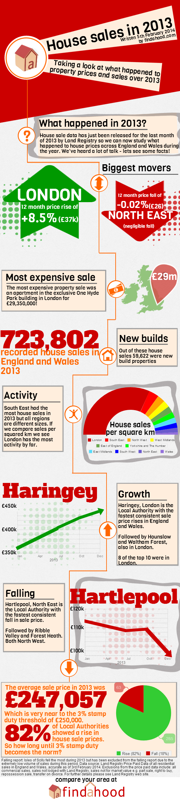
House sales and prices in 2013 infographic

We analysed all the house price and sales data for England and Wales in 2013 and produced another great infographic. Our findings may surprise you..
Everyone loves a great infographic and here at findahood.com we are passionate about everything property and love analysing and breaking down data to be useful to our many followers. So what better way to visualise what happened to the property market over the course of 2013 than with another stunning infographic.
We study which regions' property prices grew the most and which regions fell. We have the most expensive property sale of 2013, how many property sales there were and what the average property price now is. We also look at which local areas grew the most over 2013 and which local areas fell the most! Take a look:
To see if your area grew or fell over 2013 please take a look at our postcode statistic analyser to see what is happening in your local neighbourhood.
If you would like to share this unique infographic please use the share buttons below or include it on your blog with this code: